Carousel, Accordion, or Grid is a powerful includelet used to add content blocks to a page. (This replaces the Slider includelet)
The easiest way to explain the difference is with examples - you'll see one of each to the right of this text (below if you're on a mobile device). First up is a Carousel (what we used to call a Slider). Second is an Accordion. Third is a Grid.
You can add them into the main content column if you want to, or in a side column as in this example.
Block Content
For each block, you can an Image, Title, and Content (using the wysiwyg editor). These can be mixed and matched - sometimes you might just want images, other times just text, and other times both!
You choose images from your Assets Library.
You can then select how to display these blocks:
Carousel
These are great for a slideshow of images, or maybe for reviews of your site or service.
You can choose whether to show the carousel in a panel (as it is on this page) or inline. If it's a panel you can choose the colour (dependent on your site's theme).
The carousel automatically 'turns' every five seconds, and there is a row of buttons that indicates which panel is being shown, and allows visitors to select which panel they want to see.
You can configure how long the carousel pauses before moving to the next item, or disable the automatic cycling altogether.
Accordion
This is probably most perfect for adding FAQs to a page. (There is an FAQs app, but if you want more control over where the FAQs are displayed on your site, or maybe just have a small number of FAQs, then using this includelet could be better!)
In this mode, you really do need to add a Title, as it's the title of each block that's initially visible, each in its own panel, with an arrow to the right inviting users to click it.
Clicking on the title/arrow pops open that panel to reveal the image/text for that block. If you click to open another panel then any open panels are automatically closed.
Accordions are always shown inline, with each block in its own panel. You can choose the colour of the panels (dependent on your site's theme). You can choose whether or not the first item is already popped open (it is in this example!)
Grid
With this mode you'll see all blocks visible at the same time, arranged in a grid. You can choose how many columns you want in the grid, both for desktop and mobile size. In this example I've chosen two columns - though if it was in the main body of the page you could easily have more.
This grid mode could be great for showing different products, or perhaps a page of pictures and biographies of your staff members.
Image Aspect Ratio
For the main image for each item you can choose whether to show them at their real aspect ratio, or force them to fit a different ratio.
In the grid example I've selected Square, so this is how they display, even though the images themselves are rectangular.
How to add these Blocks to your Pages
Carousel, Accordion, or Grid is an includelet so you add it like you would any other. (see the Includelets page for more info on this!)
To add the includelet, go to the Layout tab of the page on which you want to add it. It'll look a bit like this:
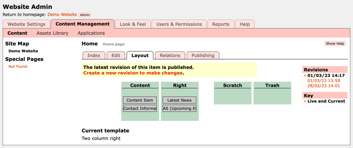
Click on Create a new revision of this page to make changes if it is visible. Then click on the Add Includelet button in the column that you want the includelet, then select Carousel, Accordion, or Grid from the list of available Includelets.
Once on the includelet settings page you can choose which layout you want.
To add a content block click the Add Content Block button, which opens a popup window from which you can choose an image from your Assets Library, and optionally add a Title and Description. Once you click on OK the popup window will close and your item will be added to the list.
You can add as many blocks as you like in this way, and also edit or reorder the blocks.
You can choose whether you want Pictures Only, or Pictures with Text, or Text Only.
Once you've selected your images, click Save changes on the includelet config. You can then go the Publishing tab to Preview or Publish your changes.
Special Thanks
Thank you to Kingston Carers Network who sponsored the development of this includelet.